

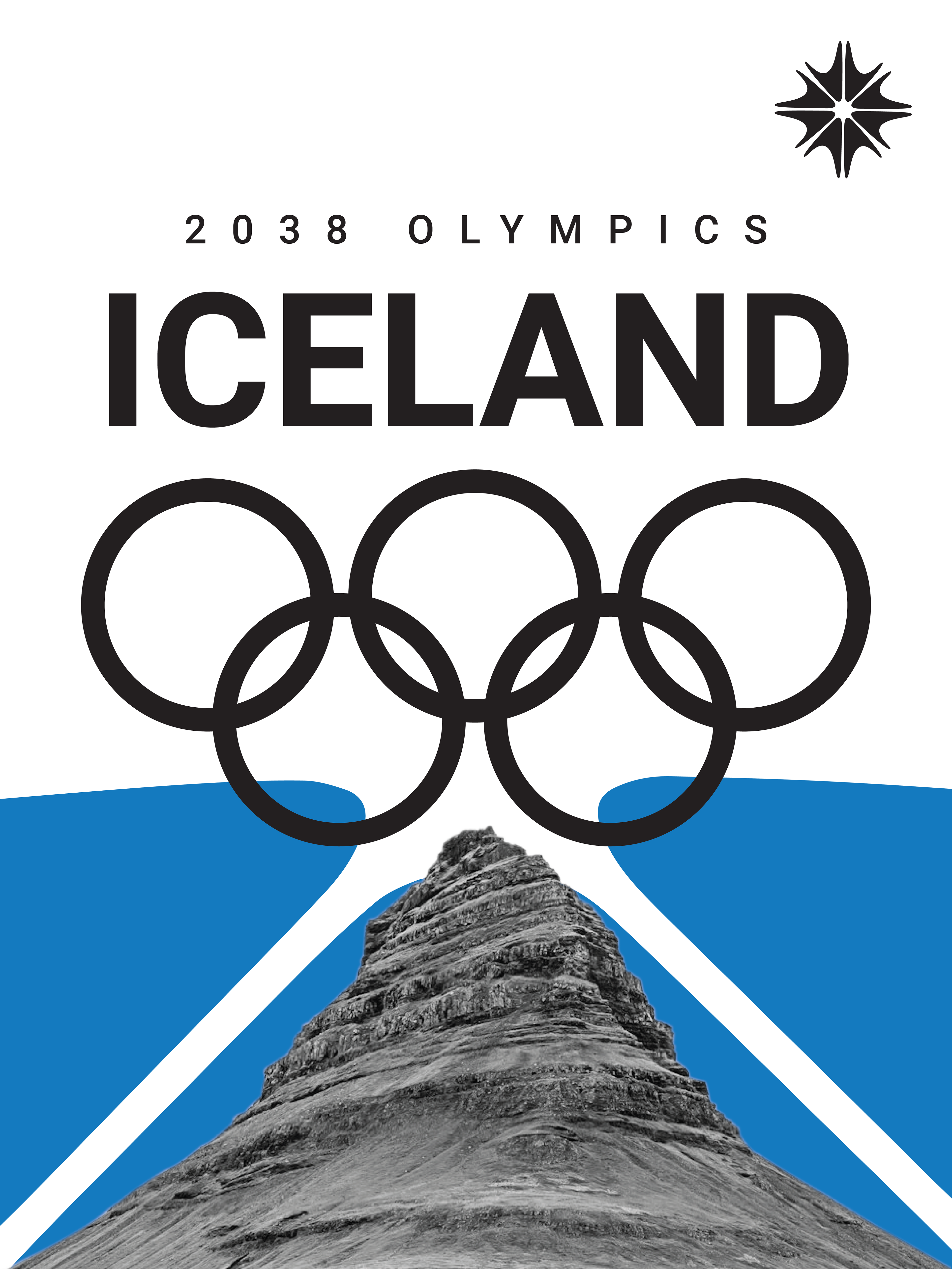
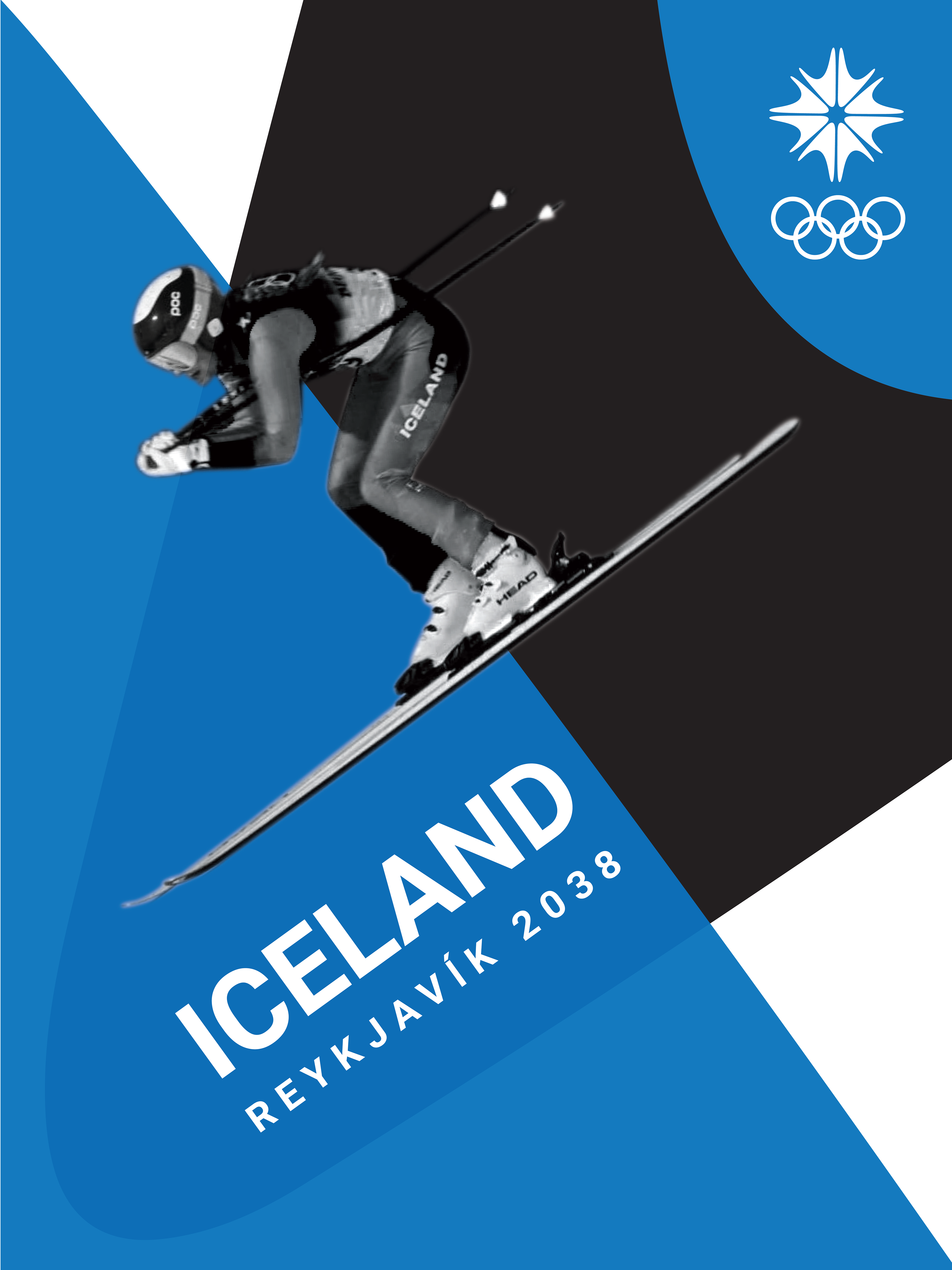
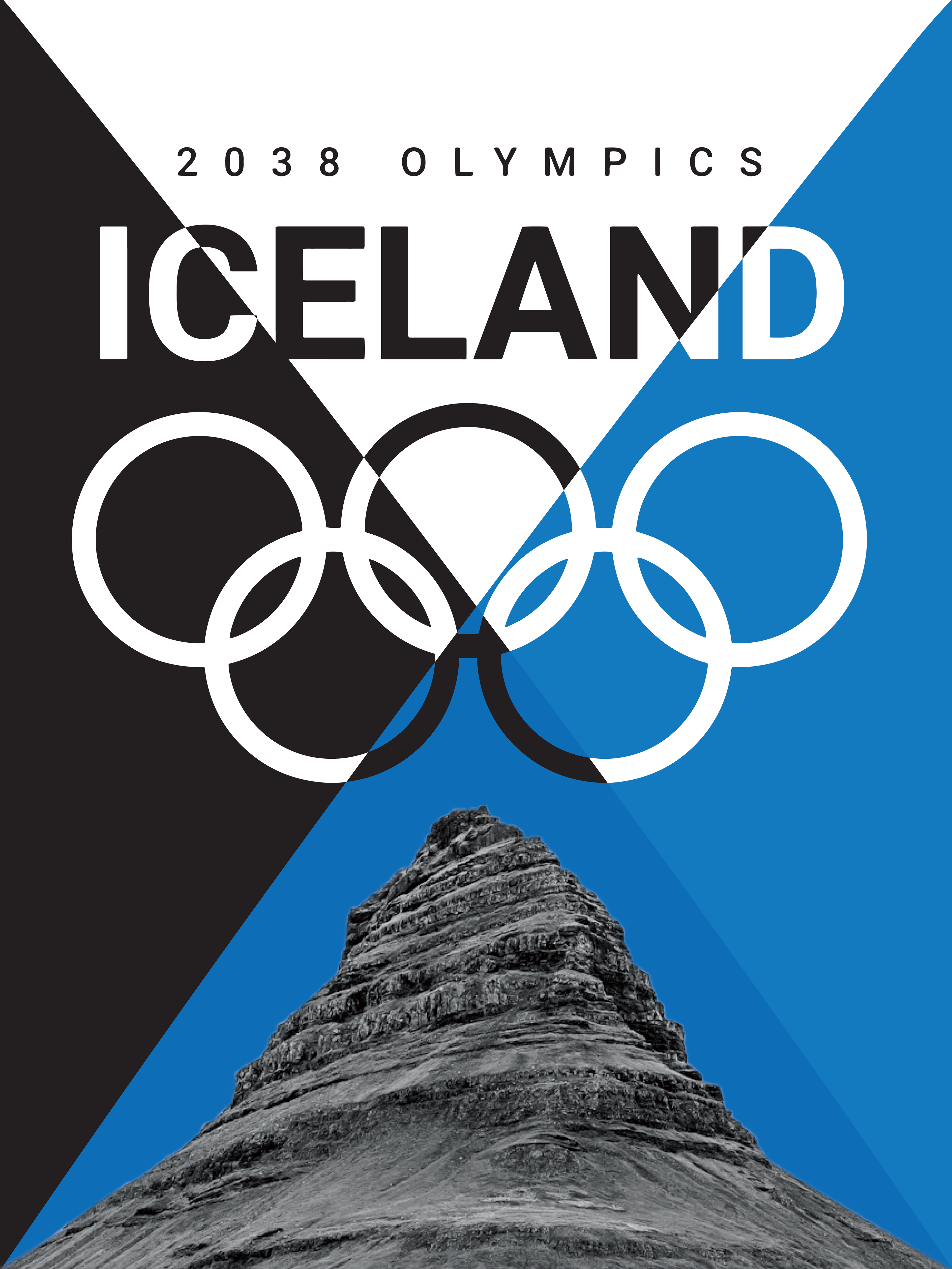
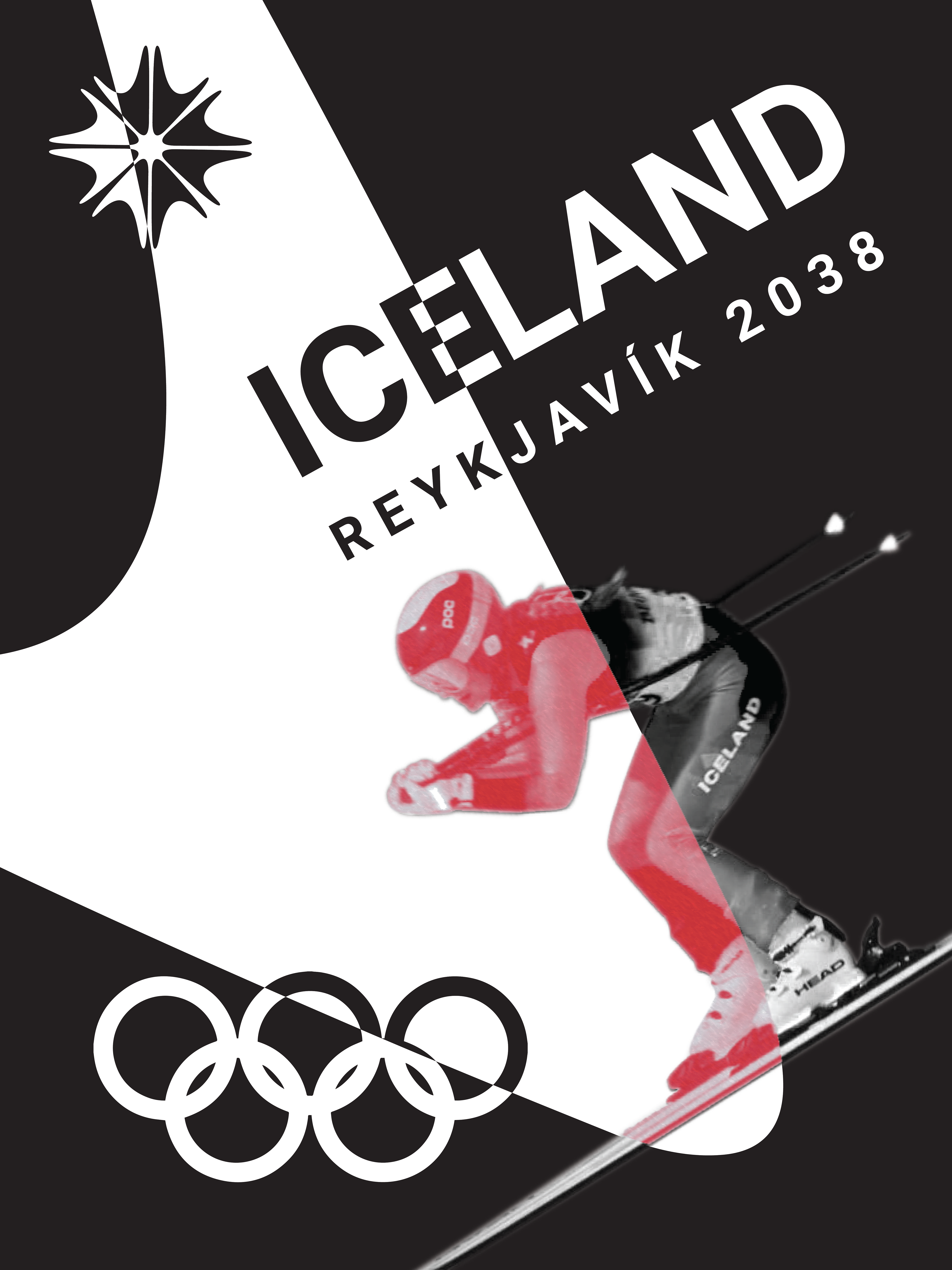
The goal of this project is to bring the aesthetics, culture, and history of Iceland to life through Olympic branding and other promotional materials. The style is based on the readings from Graphic Design Theory: Readings from the Field, edited by Helen Armstrong. I found the Constructivist style to be very inspirational for this project. Taking the simplified, yet bold colors, and merging that with the New Typography and Bauhaus movements. These movements helped create branding that is simple, universal, and timeless that perfectly conveys the Icelandic people's traditions, both from the past and today.
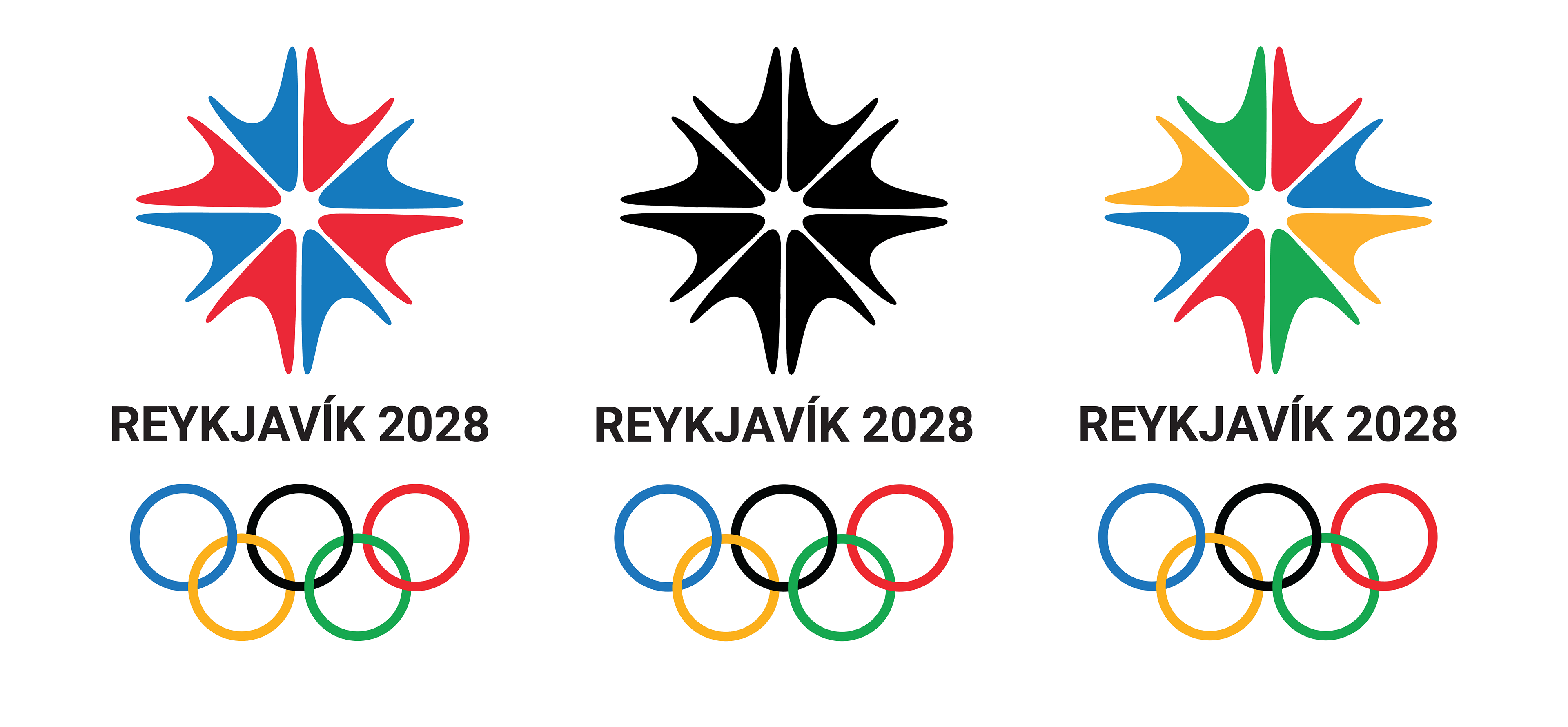
The logo was created with the idea of simplicity in mind. Taking the basic structure of Viking runes found on Viking longboats in Iceland, meant to keep a warrior safe on a journey (which is similarly reflected when a country sends an athlete to the Olympics, wishing them luck on their journey). The runic shape became the cutout, a circular shape in the center with four intersecting lines cutting through the circle's center to form a snowflake-like shape. The final logo takes reference from a snowflake, the swooped lines referencing the liquid movement of water and the curve-like dance of fire. These elements being the elements of Iceland: ice, water, and fire brought into a single logo.
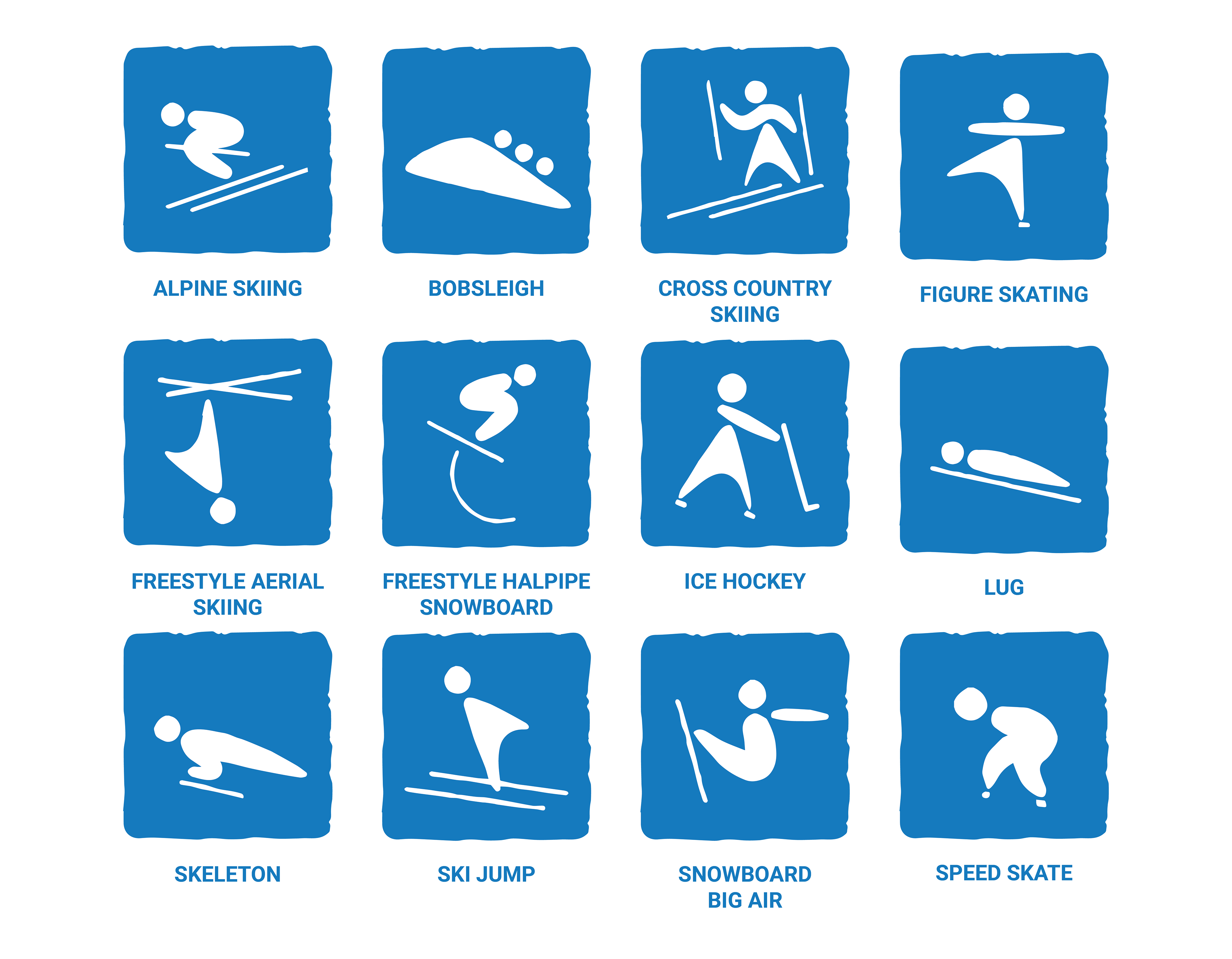
Pictograms, meant to portray each sport in a simple and straightforward way. I used the logo shape as inspiration for the body of the figures, creating something abstract but still easily identifiable.
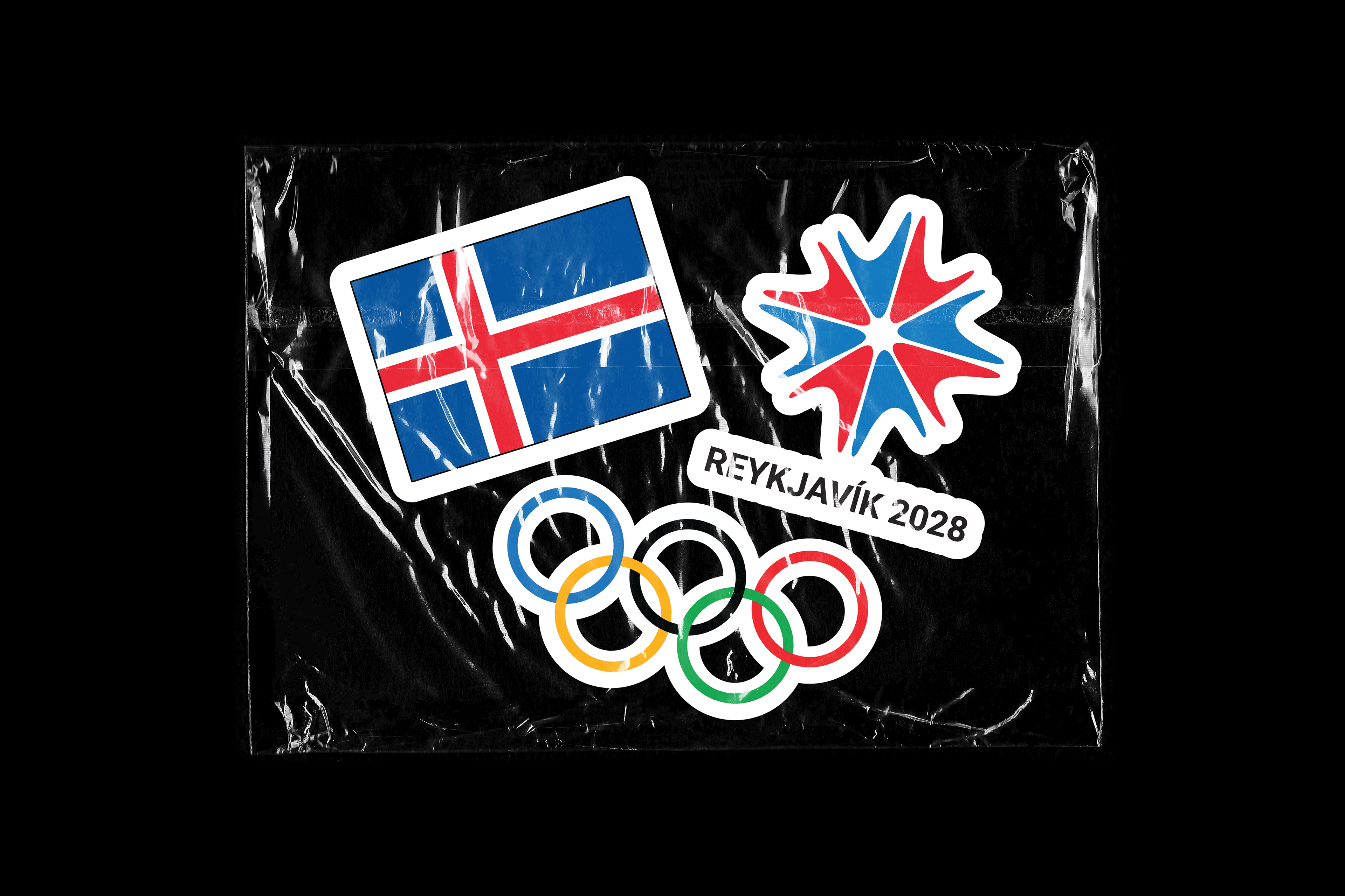
Sticker designs, simple giveaways for the Olympics with the logo, flag, and Olympic rings.
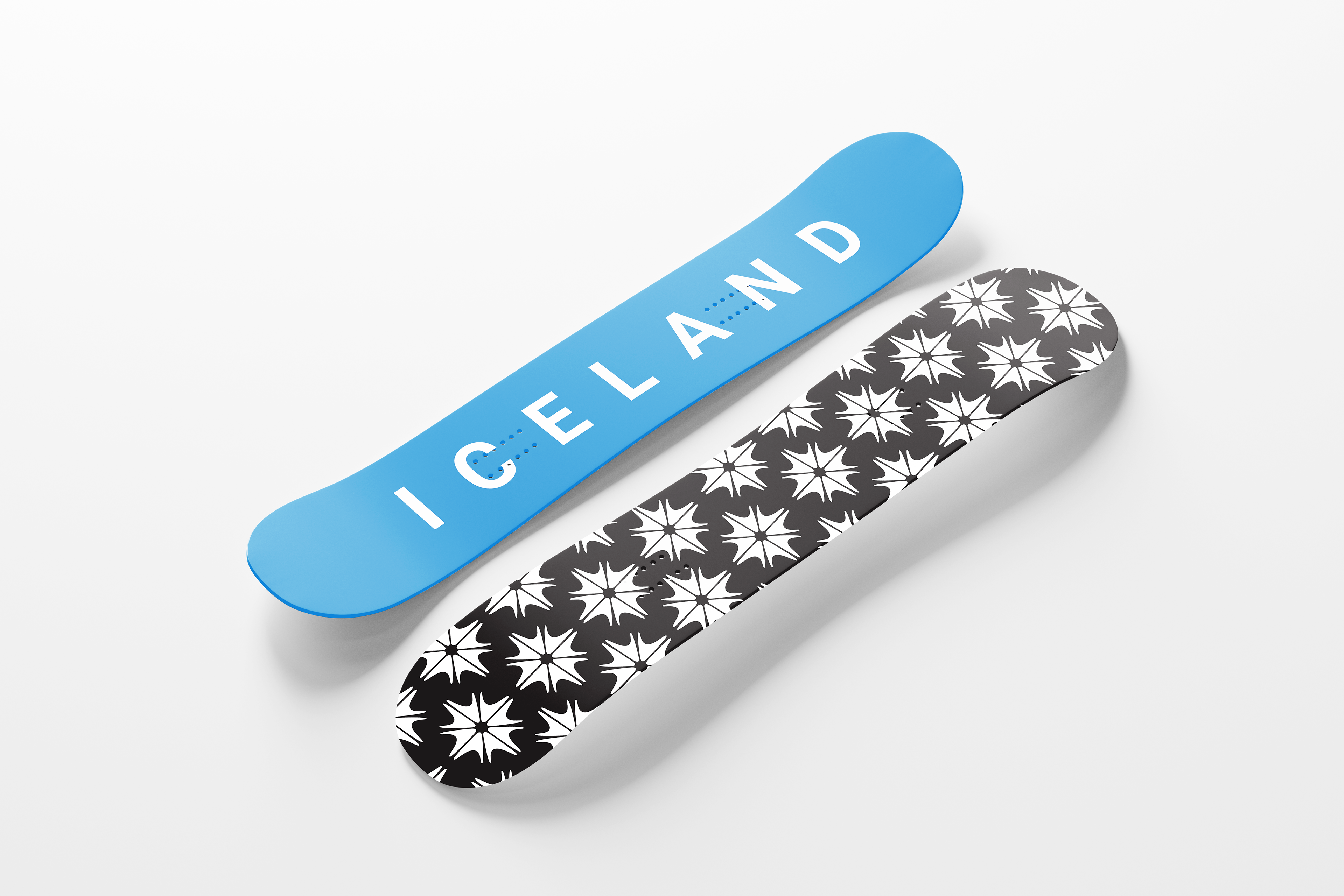
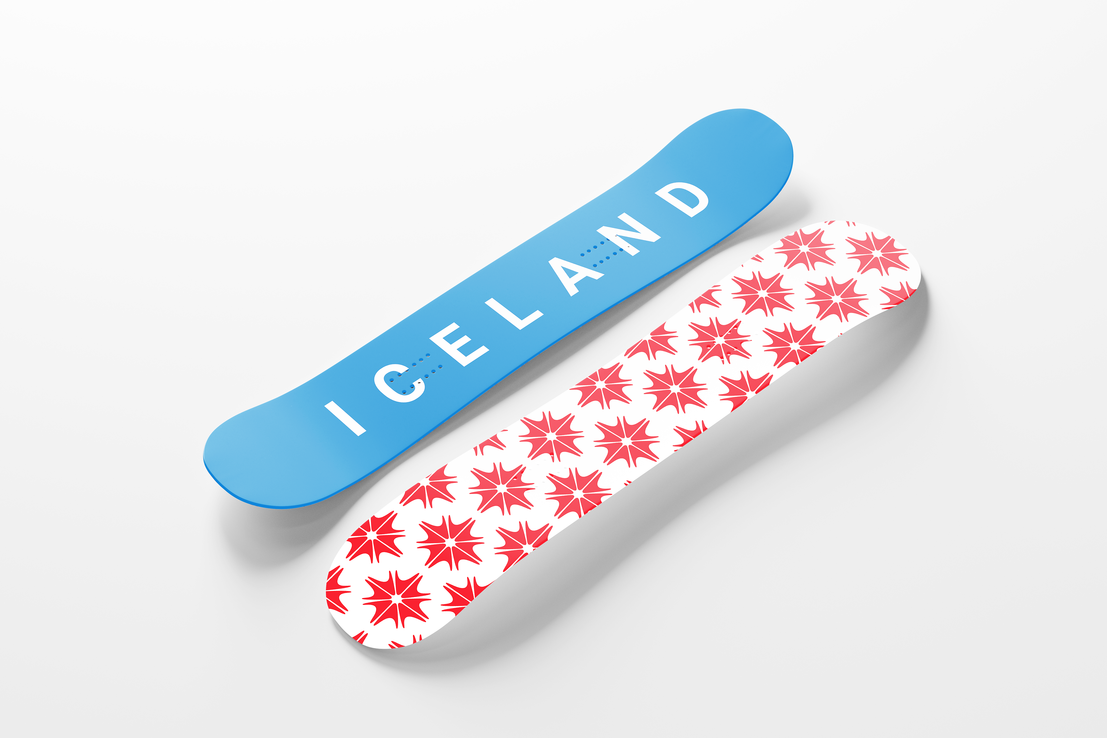
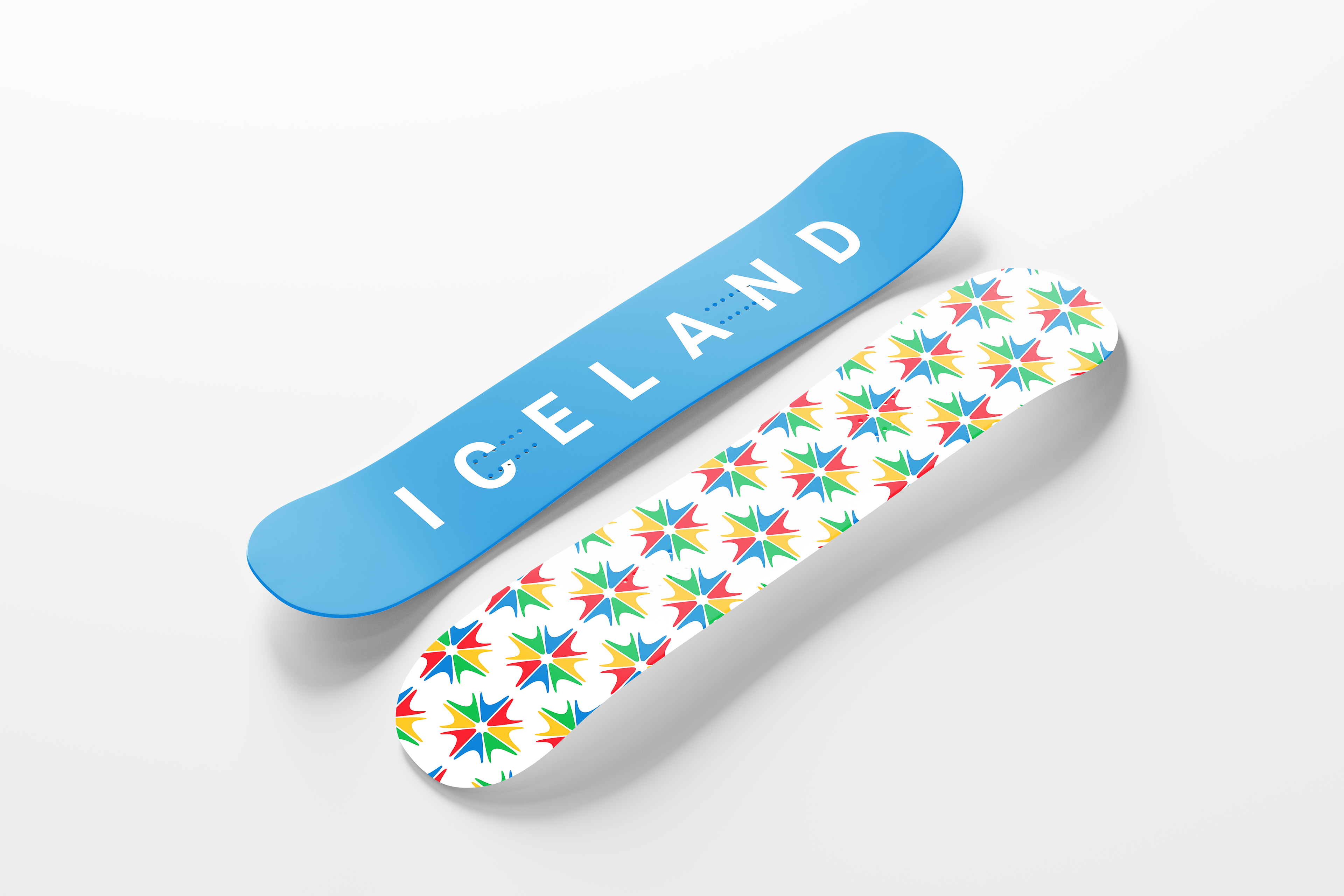

There are four different options for snowboard designs, with the Olympic branding being for the winter Olympics. Bringing in the colors of the Iceland flag (blue, red, and white) and also the Olympic colors, as well as having a more simple option with black and white.

A patch that can be sewn onto the shoulder or other placement for athlete’s gear as well as jackets and other clothing items.
Softwares Used: Adobe Illustrator, Adobe Photoshop