

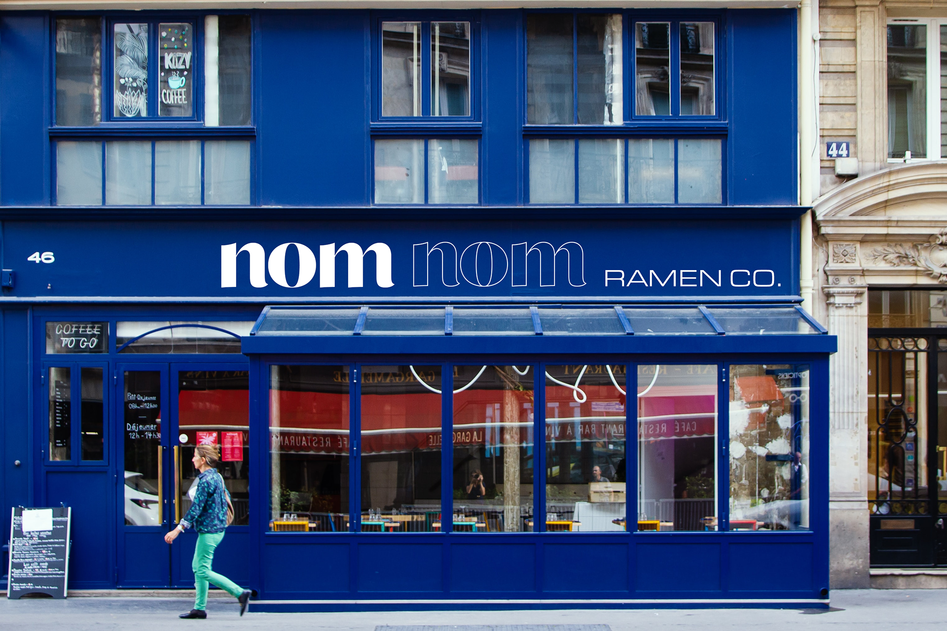
This project focused on re-designing a familiar and expected package design, one from an everyday product. There were several elements looked at when re-designing the packaging, such as the physical and emotional elements of the package that will improve not only your experience and impression of the product, but other’s as well. Packaging includes storage, shipping, display, delivery, and presenting textual information aesthetically while containing and protecting the product within. I also wanted to find ways to reduce materials and their impact on the planet, making a package design more sustainable for the future.
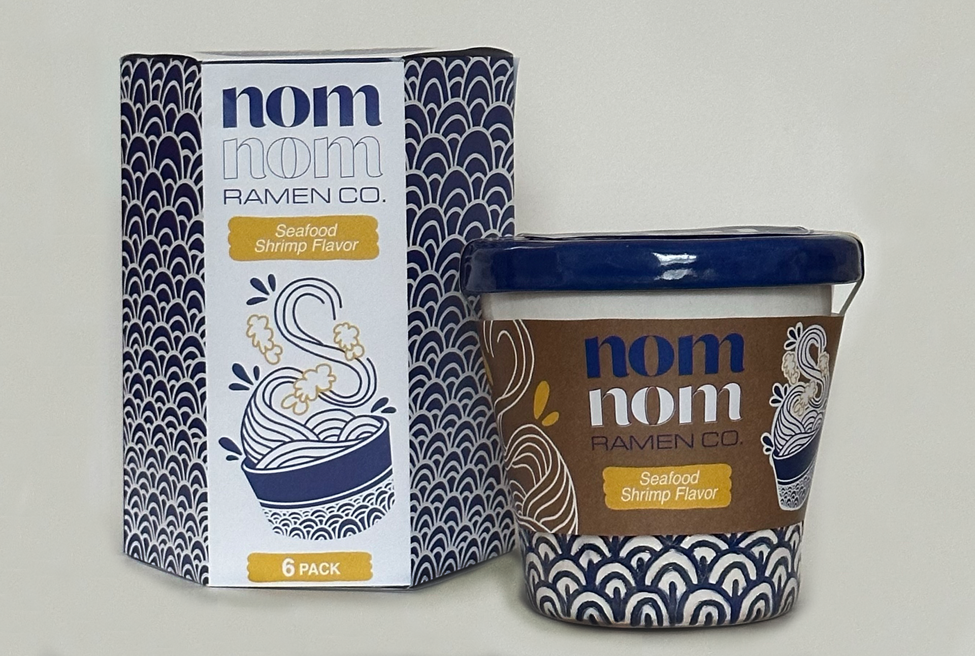
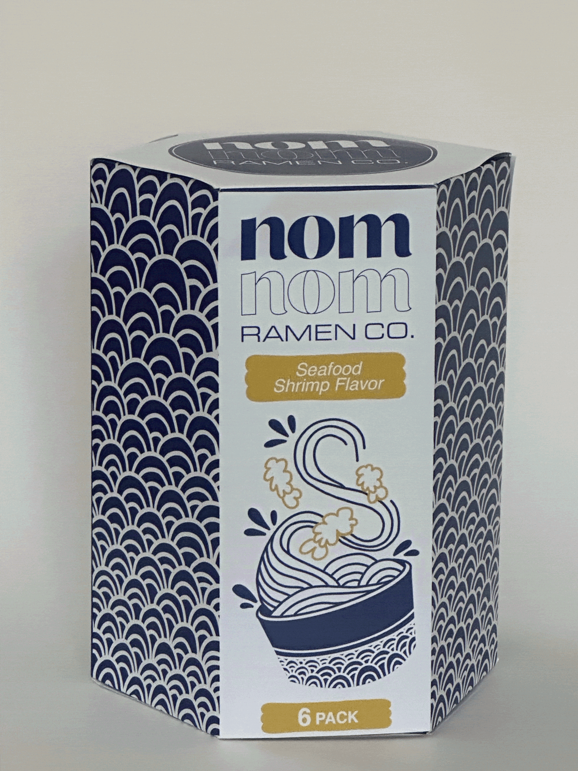
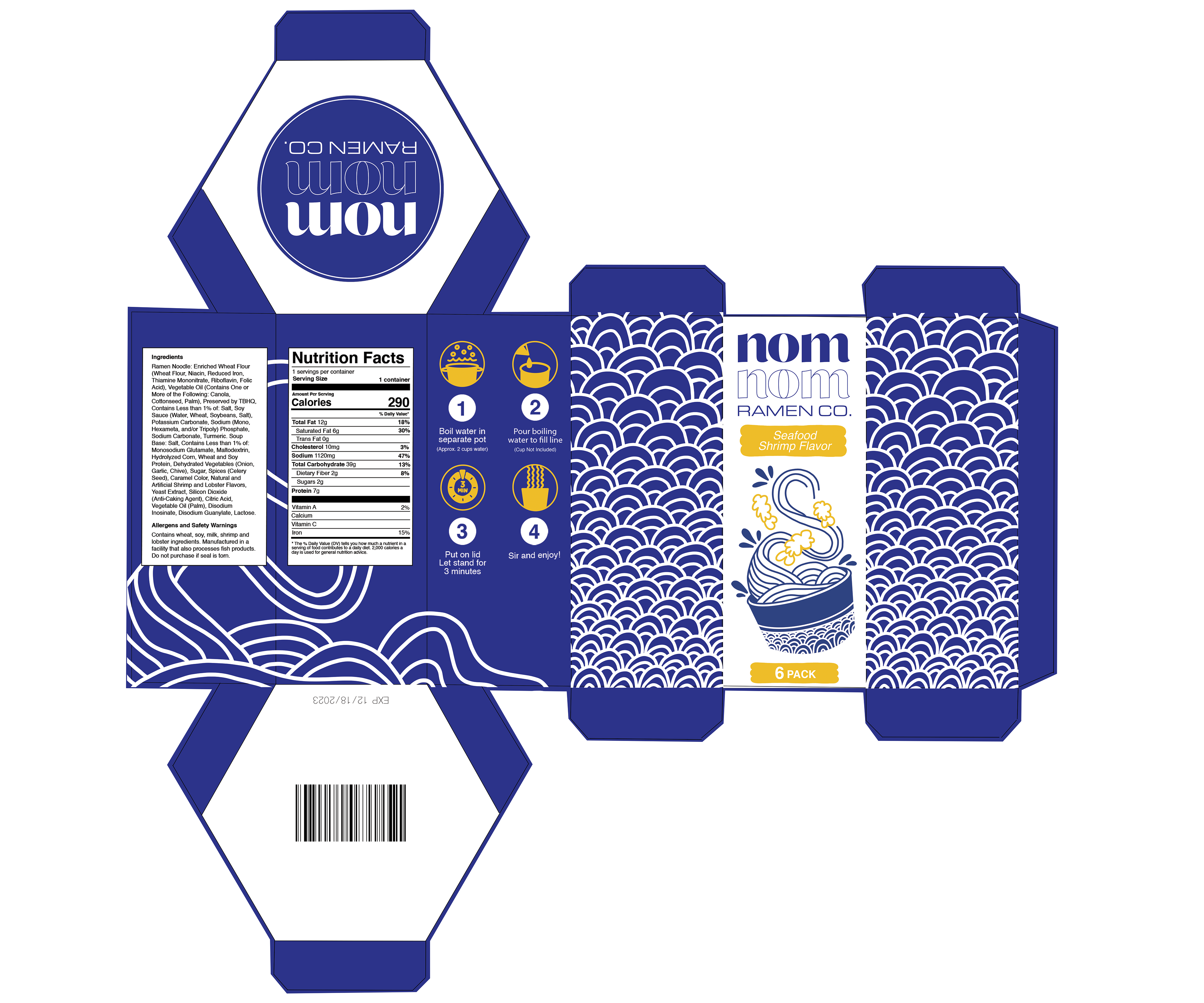
The blue design is inspired by traditional Japanese ceramics of the Edo Period (cermaics that have striking blue designs that were later brought to Europe by the Dutch). The design similar to waves, thin blue lines that can be mimicked by ramen noodles.
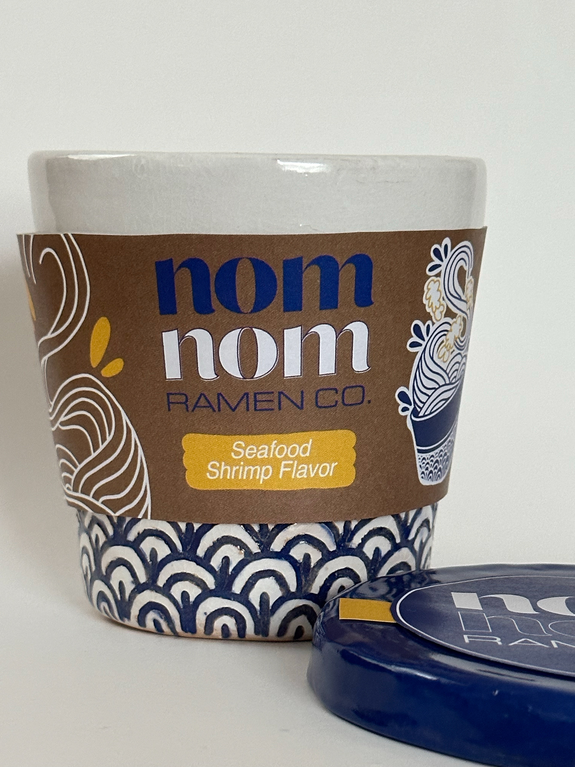
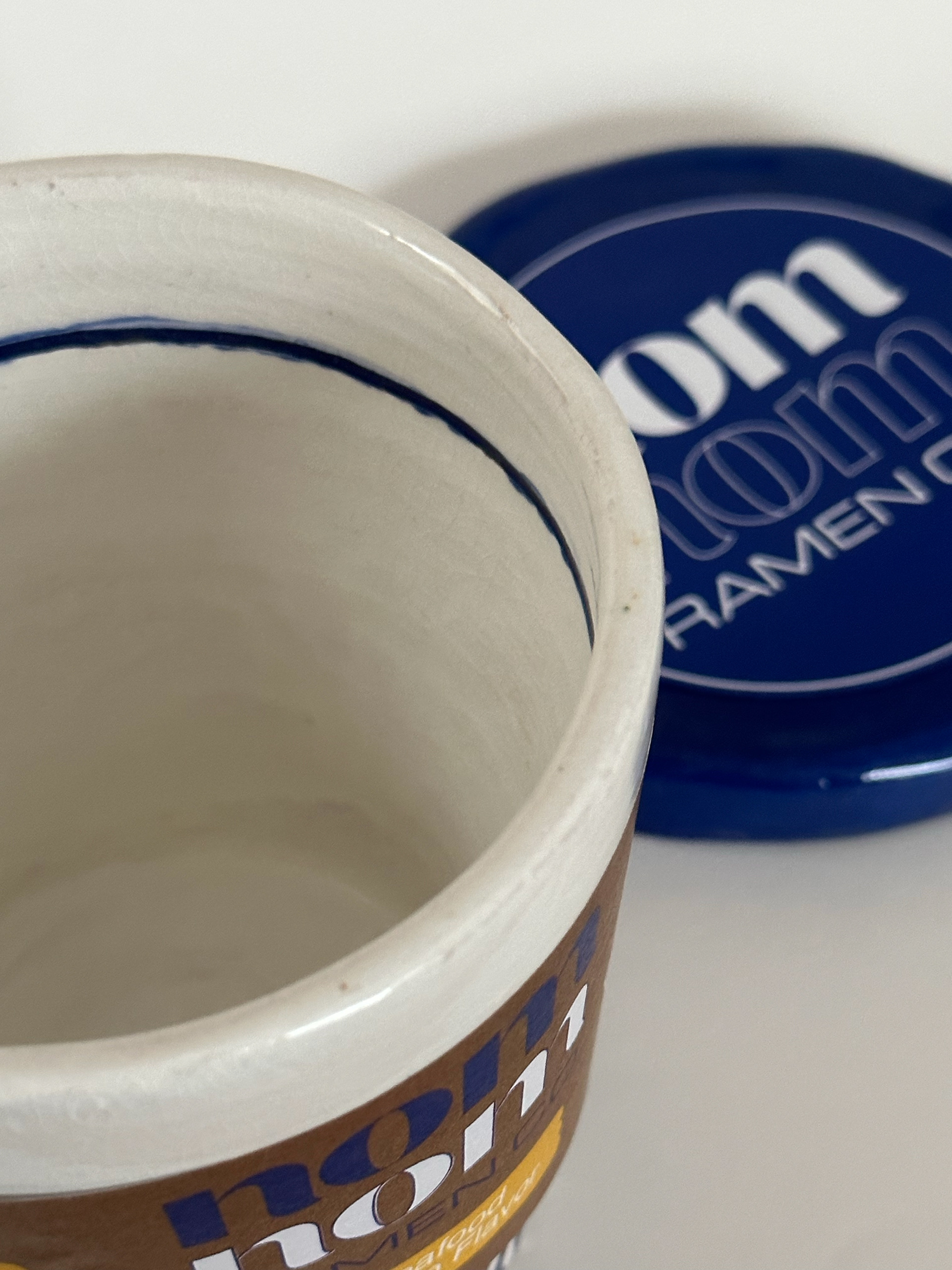
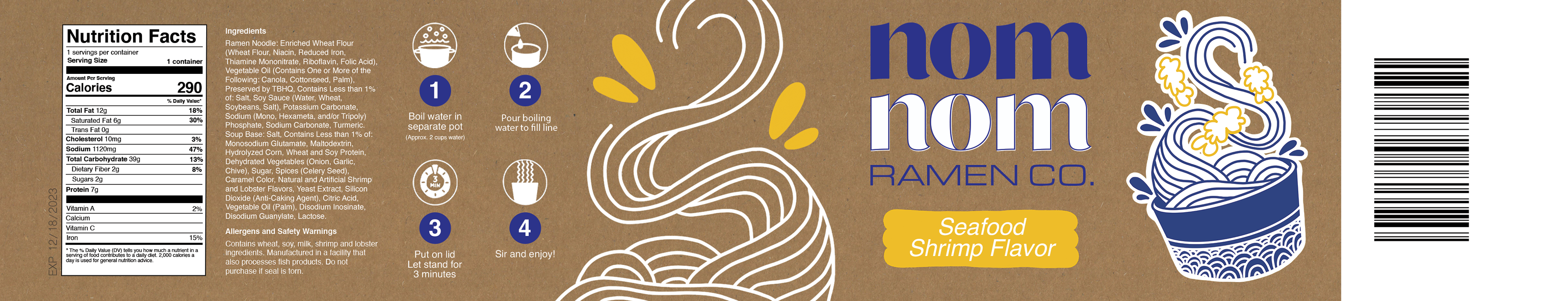
I created a ceramic vessel for the ramen cup, something that was created with clay and if thrown away will biodegrade a lot faster than plastic or styrofoam. I included a pour line that is often seen in styrofoam and other ramen cups. The packaging itself serves as a sort of cup sleeve, made of cardboard, as well as including the instructions and other information.
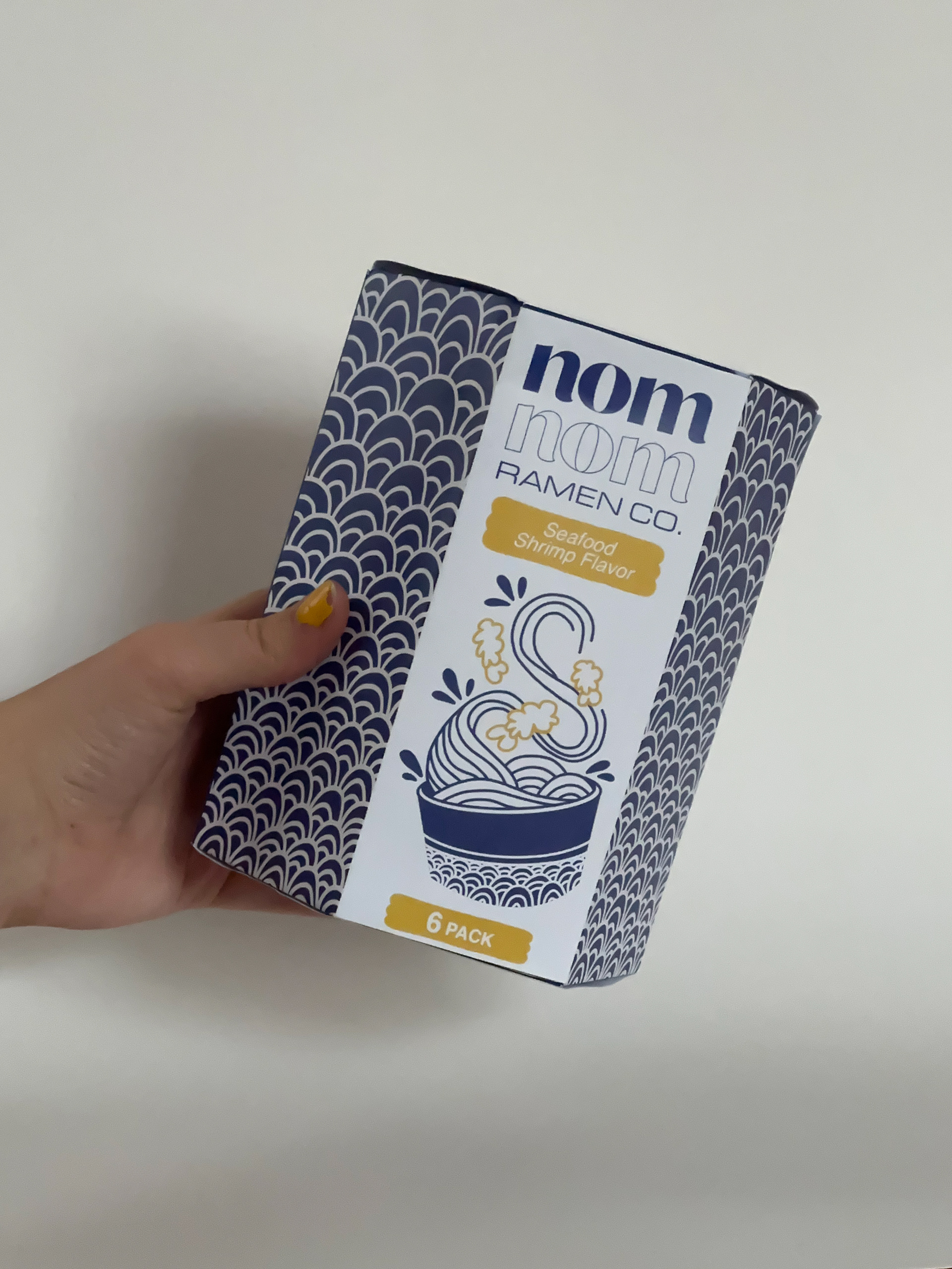
The box design does not hold the cup, but rather is a refill box for the ramen noodles and seasoning. This enables customers to not have to buy a cup every time (as it can be reused), and can be more eco-conscious.


Sticker designs that can be included with the packaging or given away at small local retailers or the Nom Nom Ramen Co. store location.
Software Used: Adobe Illustrator, Adobe Photoshop, Procreate
Skills Used: Ceramics (wheel throwing and hand building)